Project Description

HCF Health insurance
Home page re-design and IA
Output: Home page re-design across all touch points, IA mapping, continuous improvement
Duration: Q2 2024
My Role: UX, strategy, mentoring and end to end design in a cross functional team
Tools: Figma, FigJam, Confluence, Jira, User testing
Problem statement
The HCF homepage was cluttered, confusing, and ineffective. It failed to engage users and drive conversions.
- There were multiple versions of the homepage (sales, member, corporate) creating confusion and inconsistency when members wanted to compare quotes
- Focused on Health insurance only, not the suite of Travel, Pet and Life insurance available from HCF
- Excessive information cluttered the page, heat maps showed users only viewed the top third of the page content
- Numerous calls to action overwhelmed users, hindering their decision-making
- Poor seamless integration with other channels like mobile devices resulting in a fragmented user experience
The Process
1. Understand
We convened a group of all key stakeholders to define the overarching goals for the redesigned homepage. A comprehensive review of existing homepage versions revealed inconsistencies and a lack of differentiation between sales and member experiences.
Project Goal
Our primary objective was to streamline the conversion process for multiple insurance products and shift the customer’s perception of HCF beyond traditional health insurance.
2. Create & Ideate
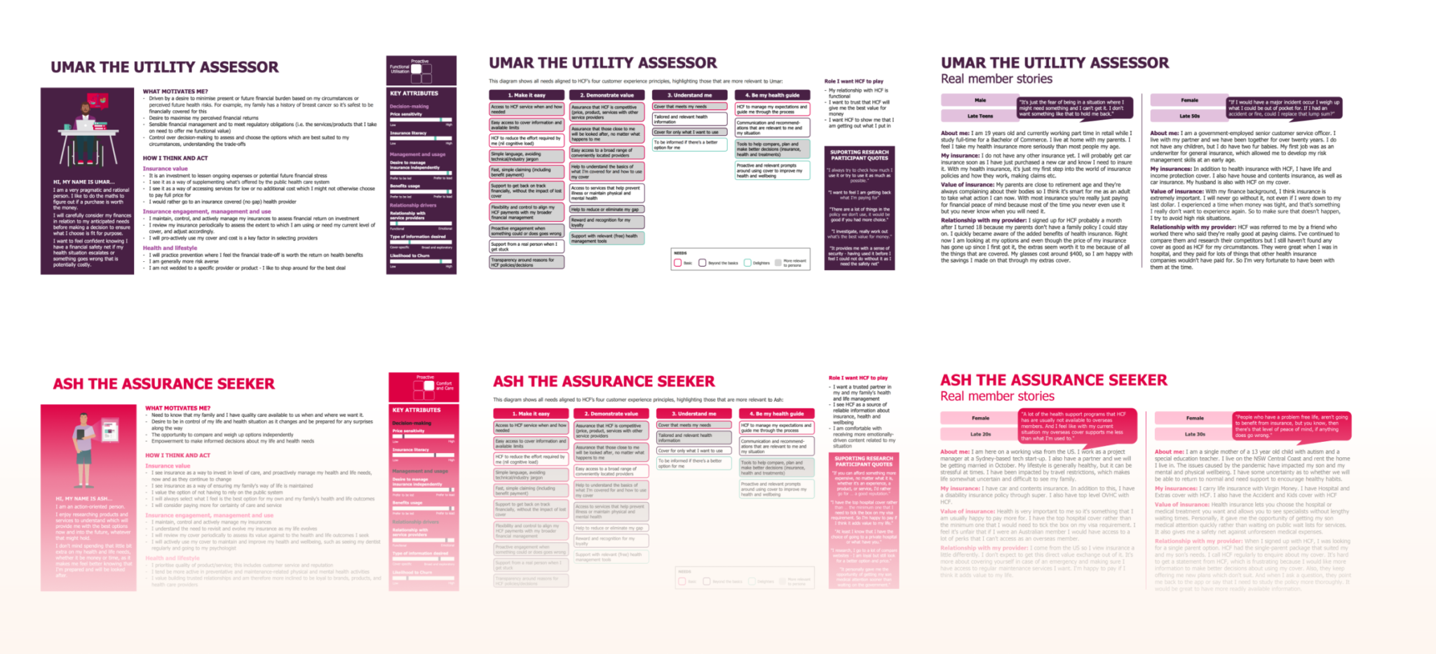
The UX team conducted a series of brainstorming sessions and critiques, resulting in three initial design concepts. Through technical validation with developers, and operations, the concepts were narrowed down to two.
Usability Findings
- The conversational quote calculator was less intuitive than anticipated.
- HCF members demonstrated a desire to obtain quotes for comparison purposes but were unable to
3. Validate
To determine the most effective design, we implemented an A/B test featuring the current state and a version incorporating the conversational quote and marketplace concept.
Key Larnings
This process included the common challenge of achieving consensus within large-scale stakeholder groups highlighting the importance of effective communication and clear documentation of decisions during meetings.
Outcomes & Success metrics
To determine the most effective design, we implemented an A/B test featuring the current state and a version incorporating the conversational quote and marketplace concept.
Key learnings from this process include the challenges of achieving consensus within large-scale stakeholder groups and the importance of effective communication and clear documentation of decisions during meetings.


